library(tidyverse)

tate <- function(x){
  x <- strsplit(split="", x)
  sapply(x, paste, collapse="\n")
}

population <- function(data, x){
    x <- data %>%
    filter(year == x, sex == "sum") %>%
    pull(population)
}

population_data <- read.csv('./population_japan.csv')
population_data <- population_data %>% group_by(year,sex)

plot <- ggplot(population_data, aes(x=year, y=population, color=sex)) +
    geom_line(aes(linetype=type), linewidth=1) +
    geom_point(data=population_data%>%filter(year==2020), size=2) +
    scale_color_manual(values=c("#ff256eff","#2b87ffff","#0c0c0cff", "gray", "gray")) +
    scale_x_continuous(limits=c(1920,2045), expand=c(0,0),
    breaks=seq(1920,2100,20)) +
    scale_y_continuous(limits=c(0,160000), expand=c(0,0),
    breaks=seq(0,150000,25000), label=seq(0,1.5,0.25)) +
    labs(
        title = '日本の総人口推移と内訳 (1920-2020) ※総務省統計局より',
        x = '年',
        y = '人口 (億人)',
    ) +

    # 関東大震災
    geom_segment(x=1923, xend=1923, color="black",
    y=population(population_data,1923),
    yend=population(population_data,1923)-10000) +
    geom_text(x=1923, y=population(population_data,1923)-15000,
    label="関東大震災", color="black", vjust=0.5, hjust=0.1) +
    # 第二次世界大戦
    geom_segment(x=1939, xend=1939, y=population(population_data,1939)-2000, yend=63000, color="darkred") +
    geom_segment(x=1945, xend=1945, y=population(population_data,1945)-2000, yend=63000, color="darkred") +
    geom_segment(x=1939, xend=1945, y=63000, yend=63000, color="darkred") +
    geom_text(x=(1939+1945)/2, y=58000, label="第二次世界大戦", color="darkred", vjust=0.5) +
    # 第一次ベビーブーム
    geom_segment(x=1947, xend=1947, y=population(population_data,1947)+2000, yend=90000, color="darkgreen") +
    geom_segment(x=1949, xend=1949, y=population(population_data,1949)+2000, yend=90000, color="darkgreen") +
    geom_segment(x=1947, xend=1949, y=90000, yend=90000, color="darkgreen") +
    geom_text(x=(1947+1949)/2, y=93500, label="第一次ベビーブーム", color="darkgreen", vjust=0, hjust=.85) +
    # 第二次ベビーブーム
    geom_segment(x=1971, xend=1971, y=population(population_data,1971)+2000, yend=130000, color="darkgreen") +
    geom_segment(x=1974, xend=1974, y=population(population_data,1974)+2000, yend=130000, color="darkgreen") +
    geom_segment(x=1971, xend=1974, y=130000, yend=130000, color="darkgreen") +
    geom_text(x=(1971+1974)/2, y=133500, label="第二次ベビーブーム", color="darkgreen", vjust=0, hjust=.5) +
    # 高度経済成長期
    geom_segment(x=1955, xend=1955, y=population(population_data,1955)+2000, yend=115000, color="darkblue") +
    geom_segment(x=1973, xend=1973, y=population(population_data,1973)+2000, yend=115000, color="darkblue") +
    geom_segment(x=1955, xend=1973, y=115000, yend=115000, color="darkblue") +
    geom_text(x=(1955+1973)/2, y=118500, label="高度経済成長", color="darkblue", vjust=0, hjust=.7) +
    # バブル崩壊
    geom_segment(x=1991, xend=1991, y=population(population_data,1991), color='black',
    yend=population(population_data,1991)-10000) +
    geom_text(x=1991, y=population(population_data,1991)-15000,
    label="バブル崩壊", color="black", vjust=0.5, hjust=0.8) +
    # 阪神・淡路大震災
    geom_segment(x=1995, xend=1995, y=population(population_data,1995), color='black',
    yend=population(population_data,1995)-24000) +
    geom_text(x=1991, y=population(population_data,1995)-29000,
    label="阪神・淡路大震災", color="black", vjust=0.5, hjust=0) +
    # 2010
    geom_segment(x=2010, xend=2010, y=population(population_data,2010), color='darkblue',
    yend=population(population_data,2010)+10000) +
    geom_text(x=2010, y=population(population_data,2010)+15000,
    label="人口ピーク(1億2800万人)", color="darkblue", vjust=0, hjust=0.5) +
    # 東日本大震災
    geom_segment(x=2011, xend=2011, y=population(population_data,2011), color='black',
    yend=population(population_data,2011)-10000) +
    geom_text(x=2011, y=population(population_data,2011)-15000,
    label="東日本大震災", color="black", vjust=0.5, hjust=0.3) +
    geom_text(x=2020, y=64797+6500,
    label="女性人口", color="#ff256eff", vjust=0.5, hjust=-0.08) +
    geom_text(x=2020, y=61350-6000,
    label="男性人口", color="#2b87ffff", vjust=0.5, hjust=-0.08) +
    theme(
        ## テキストの設定
        plot.title = element_text(size = 15, color="black", hjust = 0.5),
        axis.title.x = element_blank(),
        axis.text.x = element_text(size = 13, color="black", hjust = 0.5),
        axis.title.y = element_text(size = 15, color="black", hjust = 0.5),
        axis.text.y = element_text(size = 13, color="black", hjust = 0.5),
        #axis.ticks.x = element_blank(),
        ## 枠・目盛りの設定
        legend.position = "none",
        panel.grid.major.y = element_line(linewidth=1, color = "#e7e7e7ff"),
        panel.grid.major.x = element_blank(),
        panel.grid.minor = element_blank(),
        panel.border = element_rect(color='black', fill='transparent', linewidth=0.8),
        panel.background = element_rect(fill = "white",color = NA),
        aspect.ratio = .6,
    )

ggsave(
  plot = plot,
  file = './population_ja.png',
  dpi = 300,
  width = 6.5,
  height = 5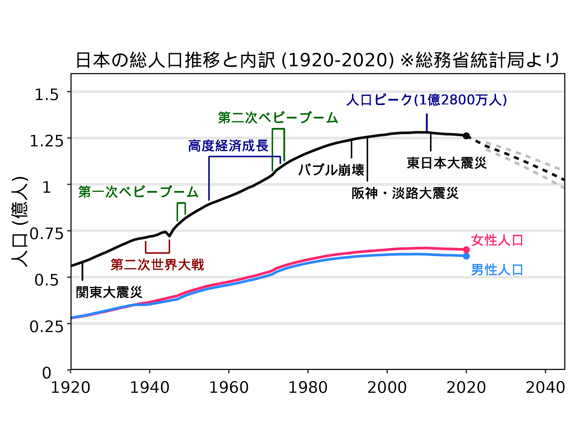
)日本の総人口の推移グラフ
society
折れ線グラフ
総務省統計局のデータを基に作成した日本の総人口の推移グラフです。完全フリーで公開しています。